by Corbin Blackburn
4 Charts Watch to Start 2025
Another year is starting, which means we have another year of Wall Street strategists making their 2025 S&P 500 target predictions. As usual there is a pretty wide range of bullish and bearish predictions, but if I had to summarize the bulk of them I’d say the street isn’t expecting a major blowout growth year like 2023 and 2024, but they’re still relatively positive on stocks as a group. I personally don’t put a lot of weight into these predictions since most have been proven to be far off in the past, but I do think it summarizes the current sentiment of investors heading into the new year.
Instead of focusing on a year-end target, I wanted to take some time to add some context to two of the areas investors are watching the closest to start the year…valuation and inflation. The second half of 2024 was much more volatile as investors wrestled with two main questions:
- Are stock market valuations too expensive?
- Is inflation picking back up now that the Fed has started lowering rates?
Those two questions dominated headlines to finish the year, and I suspect that they’ll continue to play a major role the first few months of this year. The answers to those two questions are complex and can rapidly change, but I believe the 4 charts below tell a bit of the story.
Inflation
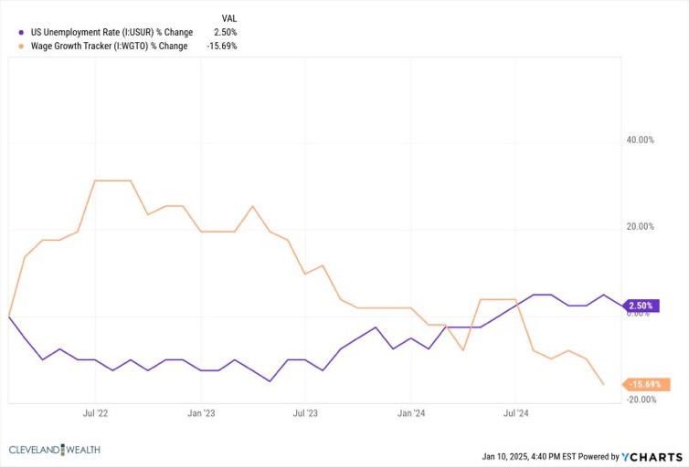
Within the first two weeks of the year, markets were already rattled by an inflation scare, which was brought on by a hotter than expected jobs report. This report quickly had people remembering 2022 when a tight labor market increased the wages corporations had to pay employees, which in turn gets passed onto the consumer with higher prices, creating a spiral of higher inflation. The jobs report was definitely stronger than anticipated, but I’m hesitant to jump on the higher inflation bandwagon again due to the chart below.
In 2022, you can see that wage growth skyrocketed at the same time the unemployment rate dropped. Fast forward to this month, it’s a bit of a different picture. Unemployment is falling again, but wage growth is actually dropping quite a bit. In other words, the labor market is tight but it’s not forcing upward pressure on corporation’s costs.

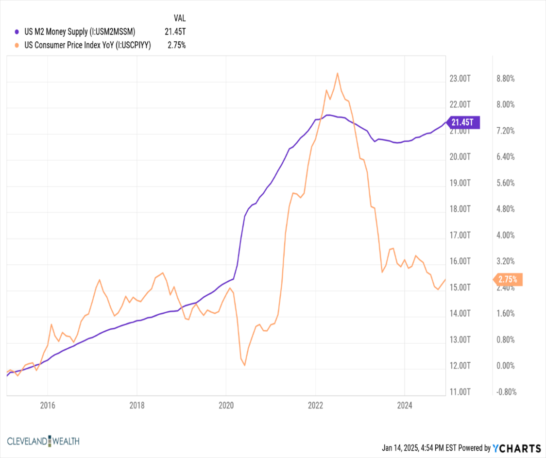
The next chart tells a similar story, as It looks at the relationship between the M2 Money Supply and the Consumer Price Index. Simply put, it’s comparing how much money is being pushed into the financial system and the effect that it has on inflation. For the majority of the last decade, we’ve had a slow but gradual increase in the money supply with a slow gradual increase in inflation. Coming out of COVID, you can see the money supply skyrocketed due to the money printing, low rates, and other easing strategies. Consequently, inflation spiked a short period after because more money was chasing the same amount of goods and services. Fast forward to the last 12 months, we are back to a gradual but slower increase in money supply, very different than what we saw in 2022.

This isn’t to say that we’re out of the woods when it comes to inflation pick-ups. We’re clearly not in a low inflation environment and these forces can change quickly. On top of that, policies from the new administration can also have an impact on inflation, both good and bad. However, drawing conclusions purely based on what happened in 2022 can be problematic.
Valuation
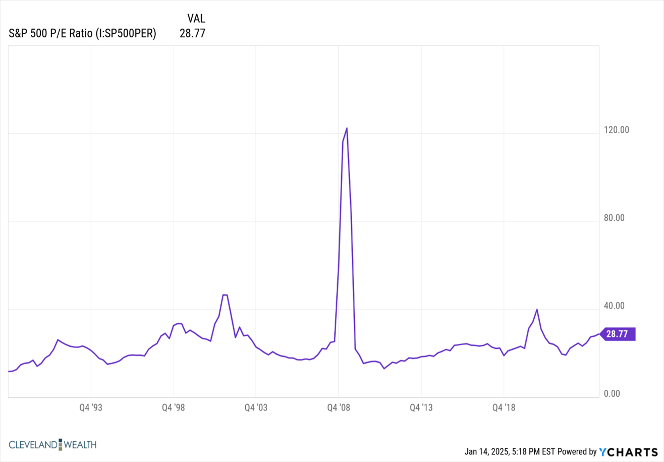
The talk of valuation in the market almost always gets brought up after long bull markets, so the fact that it’s becoming talked about more after two plus years of market growth doesn’t surprise me. With much of this growth being driven by tech companies and AI, many are relating this period to the early 2000s when the tech market became a bubble and crashed quickly. Although it’s tough to argue that valuations aren’t stretched a little bit, I think the two charts below indicate a different story than the early 2000s.

This first chart looks at the S&P 500 Price to Earnings Ratio over time, dating back to the late 1980s. Price to Earnings is a very simple way to identify where valuations are at for the stock market. During times over optimism and bubbles they tend to rise, while during times of fear and pessimism they tend to fall. With a P/E on the S&P 500 of 28.77, it’s clear to see that we’re above the average trendline over the last 30+years, but we’re very far off of the P/E ratio of nearly 50 seen back in the early 200s.

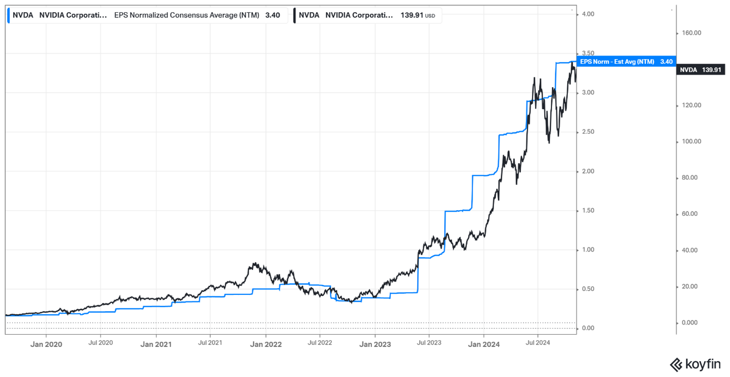
This next chart analyzes the S&P 500s largest company, NVDA. This chart is looking at NVDA’s stock price in relation to their next twelve months earnings projections. Earnings tend to be the primary driver of stock returns over the long-term, which is why the correlation between the two variables is noticeable. There are definitely times the stock price gets ahead of the earnings projections (2001), which could be a sign that the stock valuation is a bit ahead of the actual business performance. Fast forward to today on the chart, and you can see that they’re right in line, once again driving the point that a stock like this isn’t cheap, but it’s also far from bubble territory based on the earnings it is generating. If you looked at many of the other large S&P 500 stocks like AAPL, MSFT, and AMZN, they’d tell a similar story.
Time will tell whether this period is similar to 2000 or 2022, but it’s important to remember that there are hundreds of variables that impact markets, valuations, and inflation. Elements of this market have similarities, but there are also stark contrasts at the same time, despite what the headlines may say.
Cleveland Wealth, LLC is a registered investment adviser. Information presented is for educational purposes only and does not intend to make an offer or solicitation for the sale or purchase of any specific securities, investments, or investment strategies. Investments involve risk and unless otherwise stated, are not guaranteed. All charts used are for illustrative purposes only and aren’t not meant to represent a prediction or recommendation. Be sure to first consult with a qualified financial adviser and tax professional before implementing any strategy discussed herein. Past performance is not indicative of future performance.
